no, this is not the usual "which game originally came in which cabinet thread", this is a thread about something i've been wondering for quite a while!
have a look at those donkey kong and the dk junior cabinets


i guess these are the color combinations seen most often - donkey kong in light blue and junior in orange. however, since the donkey kong artwork's color scheme is clearly orange and the color scheme of junior is obviously light blue, i'm wondering why NOONE (and please correct me if i'm wrong) has tried switching those colors around.
imho DK would look much nicer in orange and JUNIOR so much better in light blue!
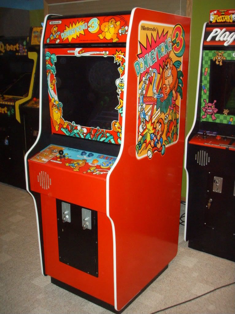
after all, DK 3 in a red cab looks absolutely KICKASS because the artwork's color scheme is uniform


i will definitely be trying that approach on my DK restos and i give a sh** about being original or not - a game has to look good!!!
c'mon guys, your turn, bring it on


